Introduction
The vignette benchmarks plotjs against various other
plotting systems for R, namely plotly. Two basic plots will
be used for this benchmark, a basic scatter plot and a grouped line
plot. I am uncertain if JavaScript execution time is counted by
microbenchmark. Even if we assume it isn’t, the benchmark
results are informative because it’s always better if the R process gets
tied up for less time per plot. First, let’s load the visualization
packages to compare:
library(plotjs)
library(plotly)
#> Loading required package: ggplot2
#>
#> Attaching package: 'plotly'
#> The following object is masked from 'package:ggplot2':
#>
#>     last_plot
#> The following object is masked from 'package:stats':
#>
#>     filter
#> The following object is masked from 'package:graphics':
#>
#>     layout
library(ggplot2)
Scatter Plot
First, we will benchmark the creation of simple scatter plots using
data from the gapminder package. To begin, we will define
functions to create similar scatterplots using each of the packages to
be compared. The plots themselves are not important but are shown to
demonstrate that they work and produce roughly similar plots.
library(gapminder)

gapminder <- gapminder

plot_base <- function(x){

  plot(x = x$gdpPercap, y = x$lifeExp)
}

plot_base(gapminder)
plot_plotjs <- function(x){

  plotjs(x = x$gdpPercap, y = x$lifeExp, sci.x = TRUE)
}
plot_plotjs(gapminder)
plot_plotly <- function(x){
  plot_ly(data = x, x = ~gdpPercap, y = ~lifeExp, type = "scatter")
}
plot_plotly(gapminder)
#> No scatter mode specifed:
#>   Setting the mode to markers
#>   Read more about this attribute -> https://plotly.com/r/reference/#scatter-mode
plot_ggplotly <- function(x){
  g <- ggplot(x, aes(x = gdpPercap, y = lifeExp)) + geom_point() + theme_minimal()
  ggplotly(g)
}
plot_ggplotly(gapminder)
plot_ggplot <- function(x){
  ggplot(x, aes(x = gdpPercap, y = lifeExp)) + geom_point() + theme_minimal()
}
plot_ggplot(gapminder)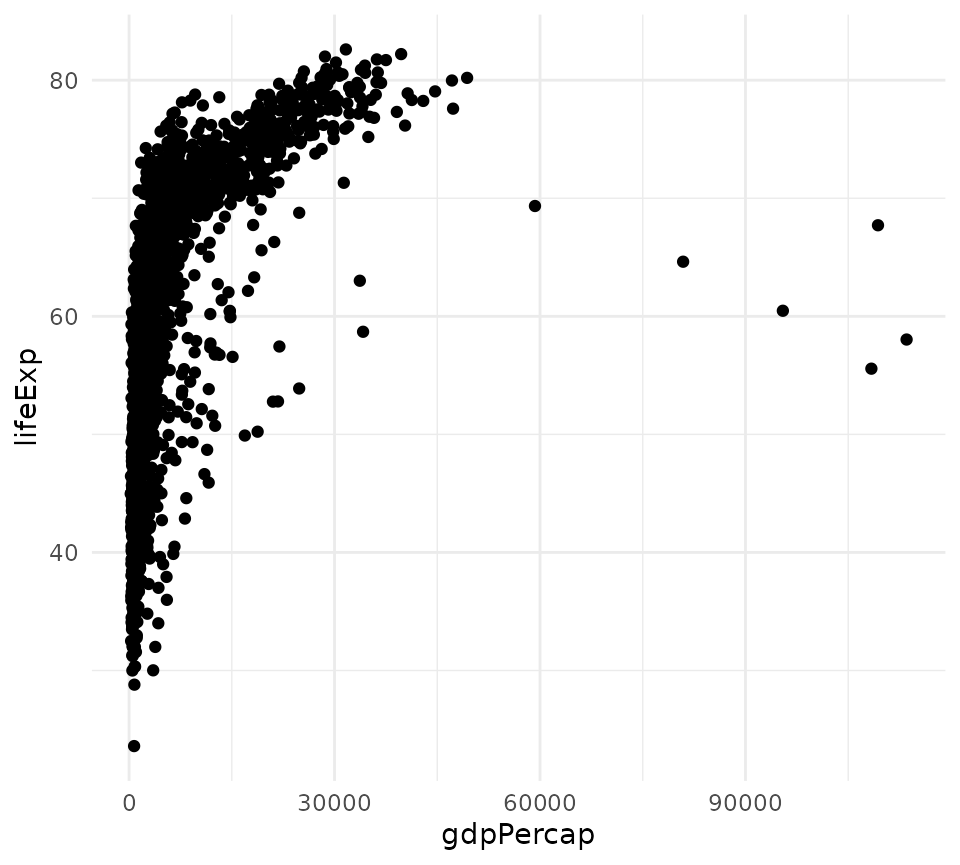
Now, these functions are benchmarked:
library(microbenchmark)
m <- microbenchmark(base = plot_base(gapminder),
               plotjs = plot_plotjs(gapminder),
               plotly = plot_plotly(gapminder),
               ggplotly = plot_ggplotly(gapminder),
               ggplot = plot_ggplot(gapminder),
               unit = "ms",
               times = 50)
m
#> Unit: milliseconds
#>      expr        min         lq        mean      median         uq        max
#>      base  23.629246  60.865074  60.5484762  61.0267845  61.658493  64.648799
#>    plotjs   0.072605   0.110847   0.1503552   0.1222180   0.134121   1.599622
#>    plotly   0.358719   0.398753   0.5135419   0.4903745   0.562178   2.064650
#>  ggplotly 163.402806 170.153523 179.5304335 177.1822535 182.841911 305.042786
#>    ggplot  33.996657  37.748793  40.6885139  39.7698110  41.947501  63.346439
#>  neval
#>     50
#>     50
#>     50
#>     50
#>     50
On my main development machine, plotjs was the quickest by an order
of magnitude. This can vary, but plotly is roughly 20 times
slower, and ggplotly() is hundreds of times slower.
However, plotly was still quick enough that the performance
difference with plotjs would be imperceptible to users.
plot(m)
Let’s look at kernel density plots of the time distributions for
plotjs and plotly.
Let’s use a two-sample Wilcoxon test to compare the means of
execution time for plotjs and plotly. A t-test would not be suitable
because we cannot assume normality. The null hypothesis is that
plotjs and plotly will have the same mean
execution time for these scatter plots.
w <- wilcox.test(m$time[m$expr == "plotjs"],
                 m$time[m$expr == "plotly"],
                 alternative = "less",
                 paired = FALSE)
w
#>
#>  Wilcoxon rank sum test with continuity correction
#>
#> data:  m$time[m$expr == "plotjs"] and m$time[m$expr == "plotly"]
#> W = 49, p-value < 2.2e-16
#> alternative hypothesis: true location shift is less than 0
Can we reject the null hypothesis?
ifelse(w$p.value < .05, "yes", "no")
#> [1] "yes"
Grouped Line plots
Making line plots colored by group is a common plotting task that
could potentially expose some slowness in plotjs. We will
make line plots of the total GDP by continent by year. First, we must
summarize the data and define functions for making this lineplot with
various packages.
library(dplyr)
#>
#> Attaching package: 'dplyr'
#> The following objects are masked from 'package:stats':
#>
#>     filter, lag
#> The following objects are masked from 'package:base':
#>
#>     intersect, setdiff, setequal, union
gdp_cont <- gapminder %>%
  mutate(gdp = pop * gdpPercap) %>%
  group_by(continent, year) %>%
  summarize(total_gdp = sum(gdp))
#> `summarise()` has regrouped the output.
#> ℹ Summaries were computed grouped by continent and year.
#> ℹ Output is grouped by continent.
#> ℹ Use `summarise(.groups = "drop_last")` to silence this message.
#> ℹ Use `summarise(.by = c(continent, year))` for per-operation grouping
#>   (`?dplyr::dplyr_by`) instead.

plot_title <- "Total GDP by Continent 1952 - 2007"
plotjs_line <- function(x){
  plotjs(x$year, x$total_gdp, col.group = x$continent, sci.y = TRUE,
         type = "l", main = plot_title, xlab = "Year", ylab = "GDP",
         legend.title = "Continent")
}

plotjs_line(gdp_cont)
ggplot_line <- function(x){
  ggplot(x, aes(x = year, y = total_gdp, col = continent, group = continent)) +
    geom_line() +
    theme_minimal() +
    labs(title = plot_title, x = "Year", y = "GDP")
}
ggplot_line(gdp_cont)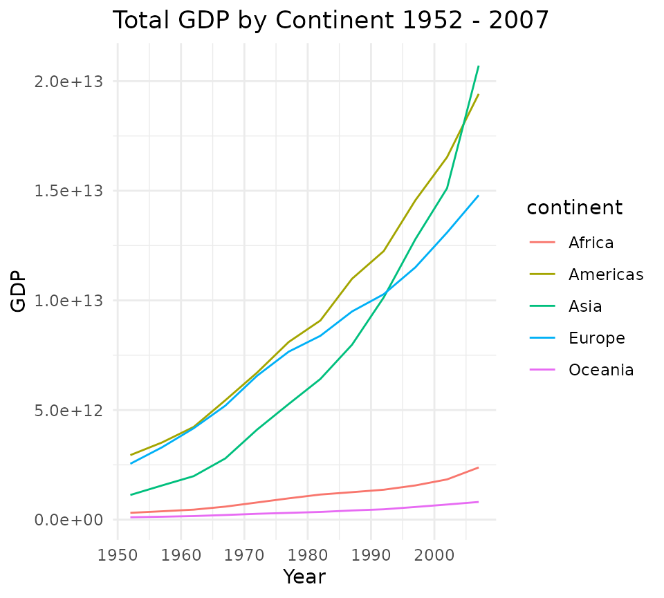
ggplotly_line <- function(x){
  p <- ggplot(x, aes(x = year, y = total_gdp, col = continent)) +
    geom_line() +
    theme_minimal() +
    labs(title = plot_title, x = "Year", y = "GDP")
  ggplotly(p)
}

ggplotly_line(gdp_cont)
plotly_line <- function(x){
  plot_ly(data = x, x = ~year, y = ~total_gdp, split = ~continent,
          type = "scatter", color  = ~continent, mode = "lines")
}
plotly_line(gdp_cont)
Now let’s benchmark these line plot functions:
m2 <- microbenchmark(plotjs = plotjs_line(gdp_cont),
                     ggplotly = ggplotly_line(gdp_cont),
                     plotly = plotly_line(gdp_cont),
                     ggplot = ggplot_line(gdp_cont),
                     unit = "ms",
                     times = 50)
m2
#> Unit: milliseconds
#>      expr        min         lq        mean      median         uq        max
#>    plotjs   0.436002   0.473974   0.5689041   0.5517940   0.584409   2.389476
#>  ggplotly 171.592587 175.660040 182.1086385 177.8061115 181.133736 312.348247
#>    plotly   0.340495   0.388815   0.5428028   0.4277025   0.531842   3.538517
#>    ggplot  35.541227  36.019188  37.9266177  36.5539200  39.219625  47.003569
#>  neval
#>     50
#>     50
#>     50
#>     50
plot(m2)
Let’s perform the same test as before:
w2 <- wilcox.test(m2$time[m2$expr == "plotjs"],
                 m2$time[m2$expr == "plotly"],
                 alternative = "less",
                 paired = FALSE)
w2
#>
#>  Wilcoxon rank sum test with continuity correction
#>
#> data:  m2$time[m2$expr == "plotjs"] and m2$time[m2$expr == "plotly"]
#> W = 1968, p-value = 1
#> alternative hypothesis: true location shift is less than 0
Can we reject the null hypothesis that plotjs and plotly have the same mean?
ifelse(w2$p.value < .05, "yes", "no")
#> [1] "no"
Conclusions
Although benchmark results will vary on different systems, the results on my development machine indicate that plotjs is faster than plotly (and others) for both the scatter plot and grouped line plot tested. Although statistically significant, the difference in performance between plotjs and plotly would almost certainly never be perceptible to users.
Both plotjs and direct use of plotly potentially offer perceptible
performance improvements over using ggplotly() to generate
interactive visualizations. Shiny developers may find this information
useful.