Benchmark
Benchmark.RmdIntroduction
The vignette benchmarks c3plot against various other
plotting systems for R, namely plotly. Two basic plots will
be used for this benchmark, a basic scatter plot and a grouped line
plot. I am uncertain if JavaScript execution time is counted by
microbenchmark. Even if we assume it isn’t, the benchmark
results are informative because it’s always better if the R process gets
tied up for less time per plot. First, let’s load the visualization
packages to compare:
library(c3plot)
library(c3)
#>
#> Attaching package: 'c3'
#> The following objects are masked from 'package:graphics':
#>
#>     grid, legend
library(plotly)
#> Loading required package: ggplot2
#>
#> Attaching package: 'plotly'
#> The following object is masked from 'package:ggplot2':
#>
#>     last_plot
#> The following object is masked from 'package:stats':
#>
#>     filter
#> The following object is masked from 'package:graphics':
#>
#>     layout
library(ggplot2)
Scatter Plot
First, we will benchmark the creation of simple scatter plots using
data from the gapminder package. To begin, we will define
functions to create similar scatterplots using each of the packages to
be compared. The plots themselves are not important but are shown to
demonstrate that they work and produce roughly similar plots.
library(gapminder)

gapminder <- gapminder

plot_base <- function(x){

  plot(x = x$gdpPercap, y = x$lifeExp)
}

plot_base(gapminder)
plot_c3plot <- function(x){

  c3plot(x = x$gdpPercap, y = x$lifeExp, sci.x = TRUE)
}
plot_c3plot(gapminder)
plot_plotly <- function(x){
  plot_ly(data = x, x = ~gdpPercap, y = ~lifeExp, type = "scatter")
}
plot_plotly(gapminder)
#> No scatter mode specifed:
#>   Setting the mode to markers
#>   Read more about this attribute -> https://plotly.com/r/reference/#scatter-mode
plot_ggplotly <- function(x){
  g <- ggplot(x, aes(x = gdpPercap, y = lifeExp)) + geom_point() + theme_minimal()
  ggplotly(g)
}
plot_ggplotly(gapminder)
plot_ggplot <- function(x){
  ggplot(x, aes(x = gdpPercap, y = lifeExp)) + geom_point() + theme_minimal()
}
plot_ggplot(gapminder)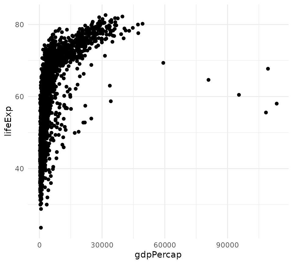
plot_c3 <- function(x){
 c3(x, x = "gdpPercap", y = "lifeExp") %>%
    c3_scatter()
}
plot_c3(gapminder)
Now, these functions are benchmarked:
library(microbenchmark)
m <- microbenchmark(base = plot_base(gapminder),
               c3plot = plot_c3plot(gapminder),
               plotly = plot_plotly(gapminder),
               ggplotly = plot_ggplotly(gapminder),
               ggplot = plot_ggplot(gapminder),
              c3 = plot_c3(gapminder),
               unit = "ms",
               times = 50)
m
#> Unit: milliseconds
#>      expr        min         lq        mean     median         uq        max
#>      base  24.112747  61.135876  60.6216804  61.296631  61.537867  62.382674
#>    c3plot   0.072004   0.108012   0.1543805   0.125419   0.138729   1.786223
#>    plotly   0.355313   0.456582   0.6453144   0.562665   0.615899   4.345759
#>  ggplotly 165.813627 176.274739 183.0986376 181.453437 185.506453 305.221531
#>    ggplot  33.327023  35.751679  38.7725242  38.214823  41.858583  46.683476
#>        c3   1.550744   2.037963   3.0287584   2.258289   2.369451  36.770358
#>  neval
#>     50
#>     50
#>     50
#>     50
#>     50
#>     50
On my main development machine, c3plot was the quickest by an order
of magnitude. This can vary, but plotly is roughly 20 times
slower, and ggplotly() is hundreds of times slower.
However, plotly was still quick enough that the performance
difference with c3plot would be imperceptible to users.
plot(m)
Let’s look at kernel density plots of the time distributions for
c3plot and plotly.
Let’s use a two-sample Wilcoxon test to compare the means of
execution time for c3plot and plotly. A t-test would not be suitable
because we cannot assume normality. The null hypothesis is that
c3plot and plotly will have the same mean
execution time for these scatter plots.
w <- wilcox.test(m$time[m$expr == "c3plot"],
                 m$time[m$expr == "plotly"],
                 alternative = "less",
                 paired = FALSE)
w
#>
#>  Wilcoxon rank sum test with continuity correction
#>
#> data:  m$time[m$expr == "c3plot"] and m$time[m$expr == "plotly"]
#> W = 48, p-value < 2.2e-16
#> alternative hypothesis: true location shift is less than 0
Can we reject the null hypothesis?
ifelse(w$p.value < .05, "yes", "no")
#> [1] "yes"
Grouped Line plots
Making line plots colored by group is a common plotting task that
could potentially expose some slowness in c3plot. We will
make line plots of the total GDP by continent by year. First, we must
summarize the data and define functions for making this lineplot with
various packages.
library(dplyr)
#>
#> Attaching package: 'dplyr'
#> The following objects are masked from 'package:stats':
#>
#>     filter, lag
#> The following objects are masked from 'package:base':
#>
#>     intersect, setdiff, setequal, union
gdp_cont <- gapminder %>%
  mutate(gdp = pop * gdpPercap) %>%
  group_by(continent, year) %>%
  summarize(total_gdp = sum(gdp))
#> `summarise()` has regrouped the output.
#> ℹ Summaries were computed grouped by continent and year.
#> ℹ Output is grouped by continent.
#> ℹ Use `summarise(.groups = "drop_last")` to silence this message.
#> ℹ Use `summarise(.by = c(continent, year))` for per-operation grouping
#>   (`?dplyr::dplyr_by`) instead.

plot_title <- "Total GDP by Continent 1952 - 2007"
c3plot_line <- function(x){
  c3plot(x$year, x$total_gdp, col.group = x$continent, sci.y = TRUE,
         type = "l", main = plot_title, xlab = "Year", ylab = "GDP",
         legend.title = "Continent")
}

c3plot_line(gdp_cont)
ggplot_line <- function(x){
  ggplot(x, aes(x = year, y = total_gdp, col = continent, group = continent)) +
    geom_line() +
    theme_minimal() +
    labs(title = plot_title, x = "Year", y = "GDP")
}
ggplot_line(gdp_cont)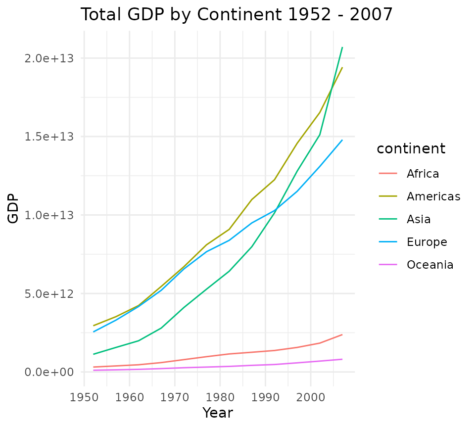
ggplotly_line <- function(x){
  p <- ggplot(x, aes(x = year, y = total_gdp, col = continent)) +
    geom_line() +
    theme_minimal() +
    labs(title = plot_title, x = "Year", y = "GDP")
  ggplotly(p)
}

ggplotly_line(gdp_cont)
plotly_line <- function(x){
  plot_ly(data = x, x = ~year, y = ~total_gdp, split = ~continent,
          type = "scatter", color  = ~continent, mode = "lines")
}
plotly_line(gdp_cont)
Now let’s benchmark these line plot functions:
m2 <- microbenchmark(c3plot = c3plot_line(gdp_cont),
                     ggplotly = ggplotly_line(gdp_cont),
                     plotly = plotly_line(gdp_cont),
                     ggplot = ggplot_line(gdp_cont),
                     unit = "ms",
                     times = 50)
m2
#> Unit: milliseconds
#>      expr        min         lq        mean      median         uq        max
#>    c3plot   0.427568   0.487099   0.5982529   0.5664315   0.617352   2.559056
#>  ggplotly 172.980832 175.293277 180.2836893 179.9565140 182.489315 206.759426
#>    plotly   0.374259   0.416668   0.5288740   0.4701820   0.589110   2.242484
#>    ggplot  35.050278  36.059972  40.8158523  37.1442505  39.399484 180.196858
#>  neval
#>     50
#>     50
#>     50
#>     50
plot(m2)
Let’s perform the same test as before:
w2 <- wilcox.test(m2$time[m2$expr == "c3plot"],
                 m2$time[m2$expr == "plotly"],
                 alternative = "less",
                 paired = FALSE)
w2
#>
#>  Wilcoxon rank sum test with continuity correction
#>
#> data:  m2$time[m2$expr == "c3plot"] and m2$time[m2$expr == "plotly"]
#> W = 1765, p-value = 0.9998
#> alternative hypothesis: true location shift is less than 0
Can we reject the null hypothesis that c3 and plotly have the same mean?
ifelse(w2$p.value < .05, "yes", "no")
#> [1] "no"
Conclusions
Although benchmark results will vary on different systems, the results on my development machine indicate that c3plot is faster than plotly (and others) for both the scatter plot and grouped line plot tested. Although statistically significant, the difference in performance between c3plot and plotly would almost certainly never be perceptible to users.
Both c3plot and direct use of plotly potentially offer perceptible
performance improvements over using ggplotly() to generate
interactive visualizations. Shiny developers may find this information
useful.